This article walks through the practical UX and development decisions behind implementing both themes and how to make them work seamlessly.
👉 Want a deeper understanding of visual hierarchy and design systems? Here's how we approach UI/UX design to build intuitive user experiences.
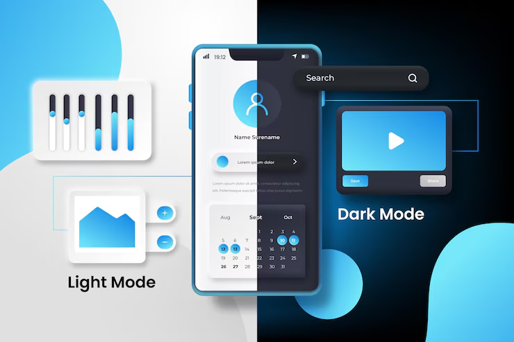
Why the Dark Mode Trend Took Off
Dark mode isn't just a visual preference; it’s backed by user behavior and environmental use cases.
Stats & Insights
According to Android Authority, 81.9% of people use dark mode on their devices.
Apple introduced system-wide dark mode in macOS Mojave (2018), followed by iOS 13.
Google recommends that app developers offer both modes for better accessibility.
User Benefits
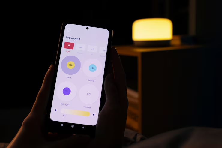
Less eye strain at night or in low-light settings
Extended battery life on OLED screens
Aesthetically pleasing for media-heavy or developer-focused apps
But it’s not all good news. Poor dark mode implementation can ruin contrast, accessibility, and overall UX.
Light Mode Still Has Its Place
Despite the popularity of dark mode, light mode remains the default for many reasons:
Superior readability for long-form content
Better for bright environments like offices or outdoor usage
More established design patterns (think newspapers, forms, and data-heavy dashboards)
Designers often start with a light theme because it has clearer typography and a predictable visual structure.
User Preferences and Personalization
It’s no longer enough to guess what users want. Today’s users expect apps to adapt to their preferences automatically.
How to Respect User Choice
Detect system-level preferences using prefers-color-scheme
Offer manual toggles in settings or navbars
Store mode preferences in cookies or databases for persistence
Building around user context—not assumption—builds loyalty.
The UX Challenges of Supporting Both Modes
It’s not just about inverting colors. Switching between dark and light modes affects:
Brand identity
Component states (like hover, disabled, or selected)
Media handling (e.g., illustrations with transparent backgrounds)
Typography contrast and accessibility
Common UX Mistakes
Black backgrounds with pure white text (harsh and causes eye fatigue)
Inconsistent button or card styling across modes
Forgetting to adjust shadows and elevations, making dark UIs look flat
This is where a solid UI system with design tokens and theme-aware components comes into play.
How to Structure Themes Technically (Without Spaghetti Code)
Creating maintainable code for dark and light mode requires a strategy, especially in full-stack apps.
Frontend Strategy
CSS Variables: Define theme tokens like --color-bg, --color-text and switch them with a class (e.g., .dark-theme).
Tailwind CSS: Use the dark: variant for utility-based theming.
Styled Components / Emotion: Pass themes via ThemeProvider with mode toggling logic.
👉 Check out how we handle these setups in our frontend development practices.
Backend Considerations
Store user preferences (dark/light) in the user profile (via cookies, DB, or localStorage sync)
Default to system preferences using prefers-color-scheme
Design Systems That Make Dual Mode Easy
A proper design system will prevent the chaos of maintaining two disjointed themes.
Key Components:
Color Palette Tokens: Primary, secondary, surface, error, text—each with light/dark values
Accessible Contrast: Ensure color combinations pass WCAG AA/AAA standards
Illustration Guidelines: Adjust or recolor SVGs and icons based on the background
Elevation and Shadows: These behave differently in dark mode and should be adjusted
Pro Tip: Use tools like Figma’s variables and mode styles to prototype both themes without duplicating frames.
Accessibility Considerations in Dual Themes
Not every user sees or perceives color the same way.
Tips for Inclusive Theme Design
Avoid relying on color alone to convey meaning
Ensure sufficient contrast ratios for both modes
Support screen readers and keyboard navigation in all theme states
Accessibility should be baked into every stage of theme development.
Performance Impacts of Theme Switching
Adding themes can unintentionally bloat your app or slow down load times.
Optimize for Speed
Lazy-load theme assets where possible
Use lightweight theme togglers that don’t re-render entire UIs
Cache preferences to avoid flashes of incorrect themes
Clean design and smart logic help maintain both performance and UX.
Testing UX Across Both Modes
Testing both modes isn’t just for QA teams—it’s a product necessity.
Test Scenarios
Toggle theme on various screens and states (form inputs, modals, tooltips)
Check system preference overrides
Validate accessibility (text contrast, focus indicators)
Ensure visual consistency with dynamic content (charts, images, alerts)
Use tools like Chrome DevTools, Storybook, or Playwright for visual regression testing.
Final Thoughts: Choose the Mode Users Want—Not What You Prefer
Dark mode vs light mode isn’t about design ego—it’s about user choice.
Let the user decide. Provide both options, test them thoroughly, and don’t assume one mode fits all contexts. Whether you’re working on a SaaS dashboard, mobile app, or ecommerce storefront, both modes are here to stay.
And if you want to structure your frontend logic around theme toggling without reinventing the wheel, lean on best practices, systems, and modularity.


No comments:
Post a Comment